Client
Atlas
Type
Product design
Year
2020
Country
California
Improving Employee Onboarding Experience
A UX case study of the design to improve employee onboarding experience on Atlashxm
Background
Atlas HXM is a global workforce management solution that helps companies hire and pay employees anywhere in the world without the need for a local entity. It does this by acting as the legal employer of record (EOR) for each employee. This means that Atlas HXM is responsible for all aspects of employment compliance, including payroll, taxes, and benefits.
Understand
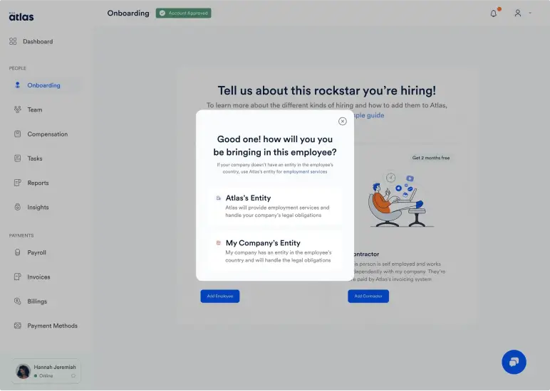
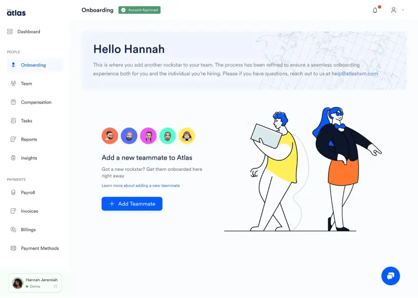
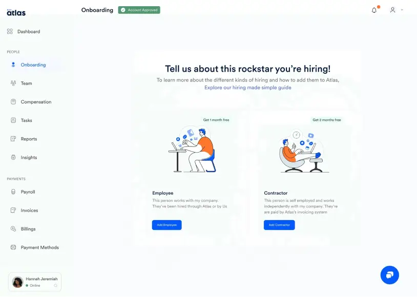
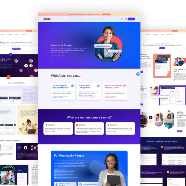
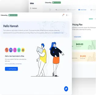
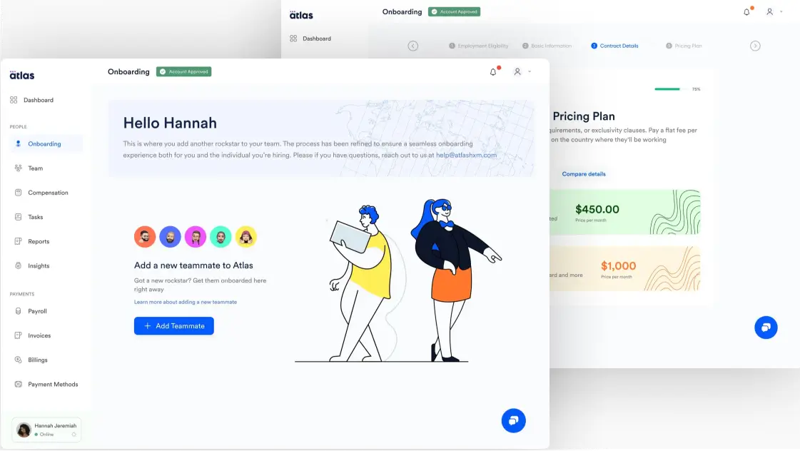
When I joined Atlashxm, we initiated the process of redesigning the entire Atlashxm platform to present a more colorful and vibrant user experience across its numerous product offerings. I was entrusted with the responsibility of creating the initial set of designs to usher in this new phase. To kickstart this endeavor, I opted to commence with the "Adding a New Hire" feature. This decision was motivated by its status as one of our most frequently used products by clients. I recognized that success in this undertaking would have a massive organizational impact, fostering alignment across all teams with the new redesign vision. Additionally, addressing this feature was crucial as it represented our most problematic experience, with numerous complaint tickets, issues, and redundancies. Triumph in this area would not only enhance the overall user experience but also serve as a tangible demonstration of the possibilities inherent in our proposed vision.
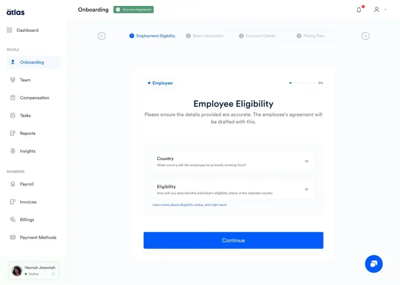
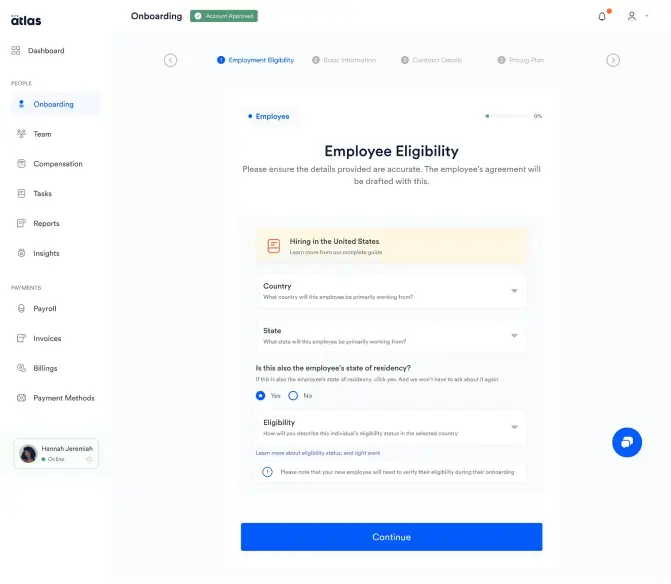
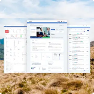
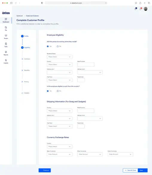
Employment Eligibility Verification From Old Flow
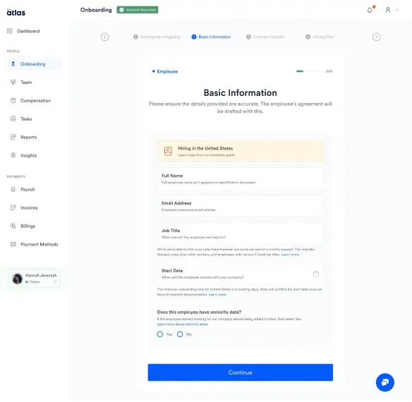
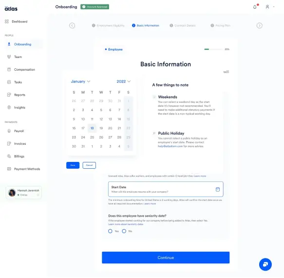
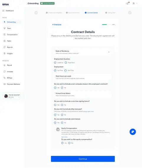
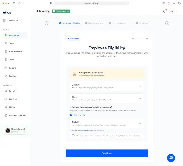
Employment Eligibility Verification From New Flow
Discover
I Implemented the following steps in the design process:
- I Analyzed the current process to get a better feel of what was and wasn’t working
- Conducted discussions sessions with members of the People and Culture team who were mostly responsible for Onboarding WSE’s and Atlas’s employees.
- Synthesized data and shared findings with the team
- Established a user flow
- Created the revamped UI
To adhere to Atlas confidentiality guidelines, only limited data can be shared
After analyzing the current flow and engaging in discussions with members of P&C, some noteworthy observations surfaced.
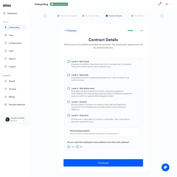
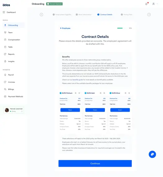
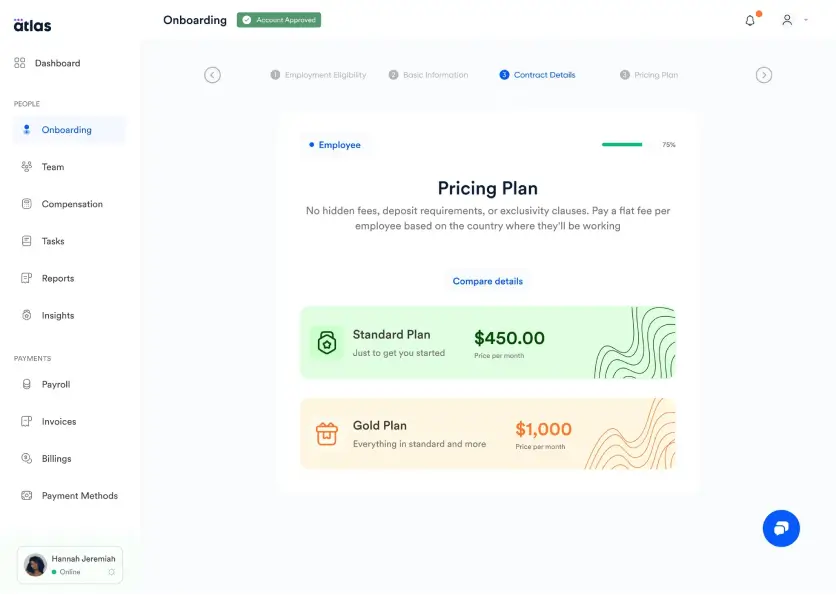
Redundancies: It became evident that certain flows, inputs, and questions lacked relevance or were unnecessarily repetitive. Simplifying certain processes through preemptive clicks, rather than requiring the completion of lengthy forms later on, could eliminate these redundancies.
Cognitive Overhead: The process of adding a new hire inherently involves a multitude of details, including contracts, legalities, compensations, and more. Unfortunately, the previous flow exacerbated this complexity. The issue stemmed from the excessive number of inputs required on a single page. Members of the P&C team shared that the overwhelming sight of multiple forms on a single page negatively impacted their productivity. Consequently, some confessed to postponing these tasks until the last minute.
An Overwhelming Need for Support: Given the fragmented nature of the onboarding process, it was inevitable that new employees would encounter specific challenges from their end while attempting to onboard. This posed a significant concern for the team, as rarely had any WSE or Atlas employee successfully onboarded without requiring assistance from customer support on multiple occasions. The problem with this situation was that it impeded the support team from efficiently executing other tasks they were also responsible for.
List: With these observations, our design direction was clearly seen. So I separated the core challenges into three aggregated categories viz a viz
Eliminating redundancies: The strategy here was to streamline the processes to their most essential elements. This involved eliminating any actions deemed unnecessary and eradicatinrepetitions.
Reducing cognitive load: Building on the previous objective, I determined that the most effective approach would be to eliminate unnecessary steps or questions, thereby reducing the initial workload. In cases where numerous forms needed completion, our plan involved distributing them across two or more sections. This was intended to alleviate visual strain, providing a temporary relief to the eye.
Ensuring that each section is comprehensively explained and its requirements well defined was part of the plan. Additionally, we aimed to enhance user understanding by incorporating links to relevant resources.
I reviewed the current Userflow due to its importance for ensuring a positive user experience I wanted to make sure that we were paying attention to very essential information for several reasons:
Clarity and User Experience: A practical Userflow ensures that the information and actions required for users to add hires were arranged in a logical and user-friendly manner.
Reducing User Frustration: With a well-structured Userflow, users would become more satisfied while navigating this process. As previously P&C members had stated that they many times abandoned the process due to its undue complexities.
Efficiency: A clear User-flow streamlines the process, making it more efficient for both users to work with.
Compliance: Depending on the country, there are usually complex legal and regulatory requirements for employees. And with a disjointed flow, it was easy to miss certain information, which could have dire consequences.
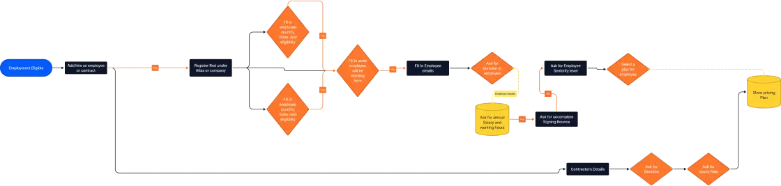
Flow Chart
Design
1. Navigation: While the existing navigation was not entirely problematic, there was room for improvement in terms of making it more intuitive and engaging.
2. Colors: Despite the plethora of color choices available in the Atlas library, the current UI lacked exploration in its color palette. Colors were sparingly used, and when implemented, they tended to lean towards the more muted shades in the library.
3. Icons and Illustrations: The current UI exhibited a restrained use of icons. Recognizing this as an opportunity to enhance the visual design ethos, I advocated for more extensive incorporation of icons and illustrations. The strategic use of these elements could significantly elevate the UI from a baseline to an exceptional visual experience.
4. Typography: While the existing typography had its merits, the limited selection of typographic scales sometimes necessitated sacrificing visual hierarchy for consistency. To address this, I proposed the addition of a few more typographic scales to broaden our options and maintain a balance between visual appeal and consistency.
UI Explorations